This past week was a bit lighter on new additions. This was mostly from catching up on tasks related to adulting, as well as the power outage on Tuesday afternoon due to the ice storm. Nevertheless here’s what’s new:
Forest and Swamp Updates
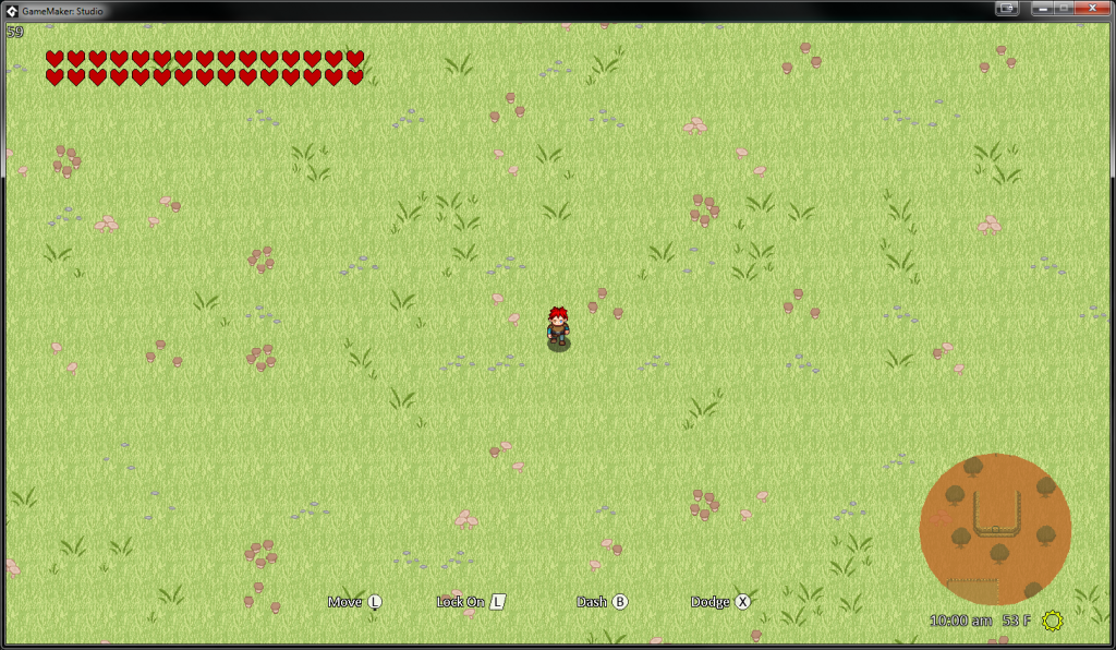
Two Saturday’s ago we had a team meeting, discussing updates to the story line, listening to new music, and of course discussing updated game play. One of our discussions was over the current swamp graphics. We decided that it wasn’t “swampy” enough. Below is the updated swamp graphics:

We decided to add some more browns and have less greens. Obviously when other assets are on the screen, such as water, trees, etc., the area will feel even more like a swamp. The good news is the time spent on old swamp graphics were not in vain, as we are re-purposing that art to be for the forest area now.
Item Dialog, Collectibles and Chests
The majority of the week was spent on adding items and updating weapons. Currently, the only “items” in the game before this past week was weapons. We needed a mechanism that all items could handle. However, not all items behave like weapons. We needed to insert an Item object at the top of the hierarchy. Now, Items have two children: Weapons and Collectibles. Weapons work the same way as they did before, while Collectibles at the moment are just things the player collects. Ultimately, there will be a purpose to collecting these collectibles. But for now, they don’t have any function. The beauty is now that we have a system in place, it should make adding these functions go very quick.

Since we have our new Item object, we were able to make a Chest object, which can contain treasure (an Item object). If a treasure is a Collectible object, the treasure can have a quantity associated with it. For example, an arrow that is not shot is considered to be a collectible. One might open a chest and find 15 arrows inside. Wahoo!

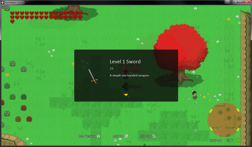
When a chest is opened, a new dialog screen pops up, informing the player the name of the item, the stat (damage for weapons, for example), the description, and a picture. The same dialog screen appears for items being picked up for the first time as well:

Pause Screen
The last major addition to the game this past week was adding a pause screen. The game actually had a pause screen before, but it was just a placeholder, and was not very functional. Though the new pause screen is not final, it at least is now usable.

I had the hardest time coming up with an adequate pause screen. This is not because the programming was difficult — rather — trying to come up with a user interface that has a good user experience. I studied Breath of the Wild’s pause screen for quite some time and concluded that pause screen was mostly perfect for what they were trying to accomplish. Here are my reasons:
- Items, weapons, materials, etc. are put into their own categories or buckets. These buckets are conveyed in a “mobile-like” tabular approach, where the name of the bucket is shown, as well as the bucket being highlighted (vs the other icons being dimmed). Buckets with multiple “pages” are represented with a little “mobile-like” circle (not implemented currently). This idea makes finding and sorting items and weapons quick and easy.
- Content is on the left and descriptions is on the right. Since most languages are read left to right, it also makes sense that the buckets (or selections) are on the left, and what it does is on the right.
- The three main top level menus are controlled separately. Currently, only “inventory” is built in the screenshot above, so it hasn’t made sense to build the functionality of the top level menus. But I love the idea that
LandRmove these top level menus, since they are on the “top” of the controller.
Breath of the Wild’s pause menu is purposely simplistic, and feels like you’re on a mobile device, but the inputs are with a controller instead of gestures. This is something I will continue to try to capture with our menu, and thus continue to iterate with these ideas in mind.
Conclusion
We are a little over halfway done with February. These next couple weeks we hope to wrap up the bulk of the main “system” for the game. From there, we will begin using these assets to start building out the actual game. Stay tuned!
