It’s been quite a few days since the last post. We’ve done lots of tedious behind-the-scenes work, mostly involving graphic updates. Here’s a little of what we’ve done:
Updated Weapons
If there was any new real “feature” from this update, it would be changing the weapon mechanic slightly. One thing I noticed as people were playing the game is most would use the Sword and Shield combo (myself included). Perhaps this is because the Shield comes naturally with the Sword, but I wanted to find a way to make the Sword less “OP” so that more would be drawn to the Mace and Spear. When the player was facing up or down, the Sword‘s hit box would span from -90° to 90°. This would cover quite a bit of area. We decided to shrink the range to be -45° to 45° — still covering quite a bit of area, and still feeling natural, but losing a little bit of its “edge” in range. The Mace on the other hand would keep its -90° to 90° hitbox range. With the Mace‘s power and range, it might make players more willing to use the weapon now.
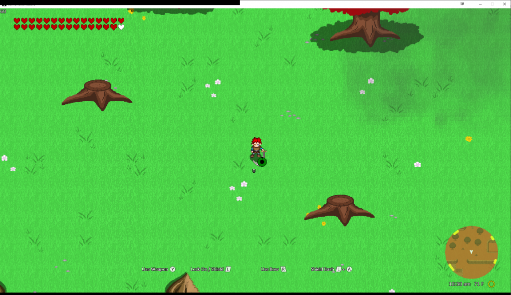
By doing this, we obviously had to update all the animations for the weapons currently in the game. When I was getting the initial ideas of the weapon mechanic, I used a “git-er-done” approach, and sort of faked the animations. Though the animations currently in the game are not final, everything is now connected to the player. If we would have in the past looked really closely, we would have noticed that most of the animations from the player and the weapon were not actually aligned. This was most noticeable with the Mace weapon. Now all of the weapons are properly aligned with the player.
To implement the mechanic, and fixing the “git-er-done” approach, we had to go tediously frame by frame to match them to the player’s animation. You may have noticed I left out the player facing left or right when describing the Sword earlier. This is because these range’s hit boxes were really off — mainly due to the drawing perspective. Thus, we had to add these animations manually as well, which took a bit of time and patience.
Alas, we have a base for all of our weapon animations. What does this mean? We can now produce more weapons of the Sword, Spear or Mace type by following a few simple rules. Of course, this is all still manual, but positioning is now less painful.
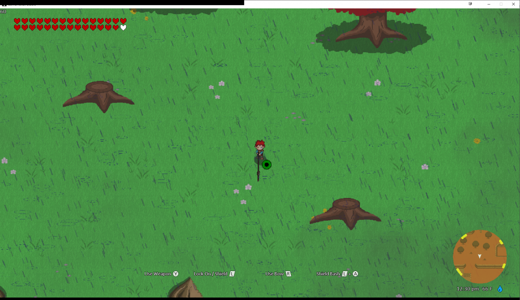
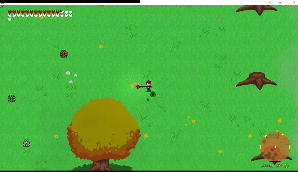
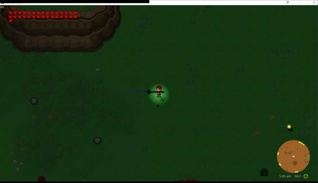
So far we’ve added a variety of different weapons. There is plenty more to come, but I was distracted by other polishing items. Take a look below:




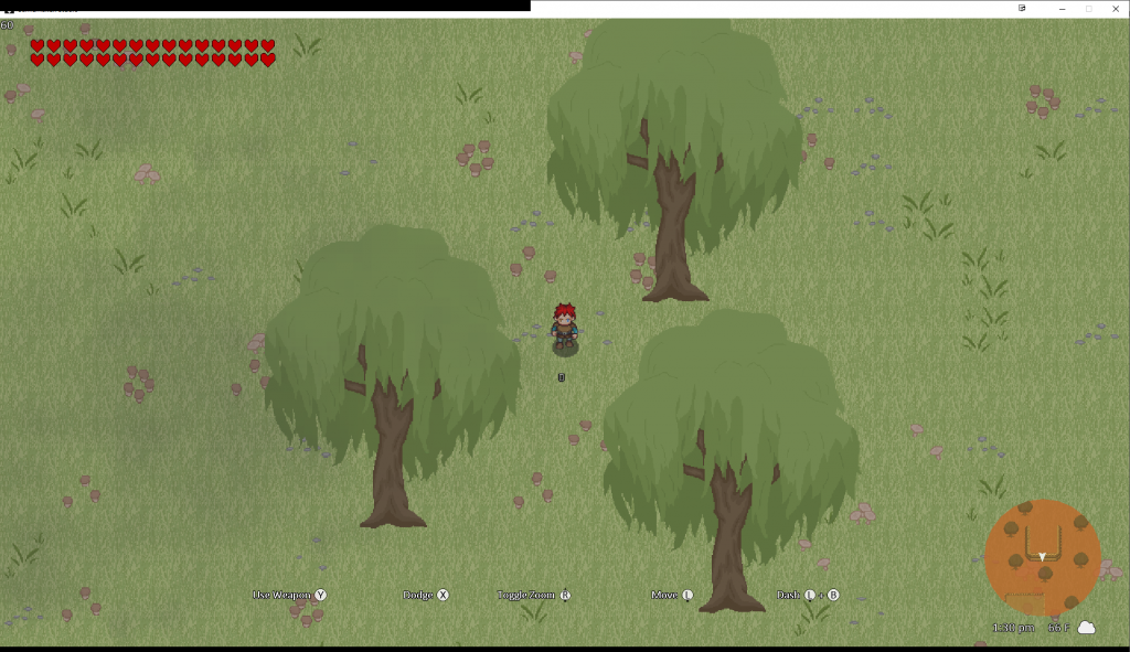
New Trees
Hannah has been hard at work the last couple weeks adding new graphics. Here area a few new trees:


WIP Cave
I forgot when I said that the updated weapon mechanic was the only “real” new feature. We started a cave concept right on the end of the last update and the beginning of this update.

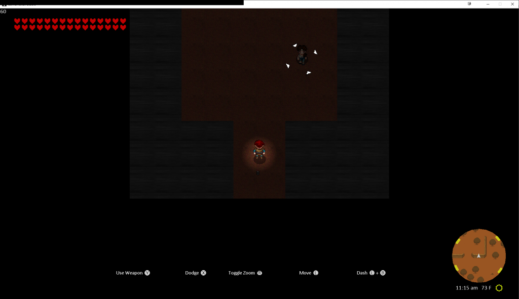
The reason why this is still WIP is because it’s using a mixture of two mechanics — the building mechanic and the layerDepth mechanic of bridges. Originally, buildings were decided not to have “roofs”. If one went inside a building, the walls and roofs would simply fade out — there was no collision on them. However, with a cave, we could technically be able to walk on the tops of them (at least, that’s how I envision them working). To make this possible, I ported over some of the layerDepth mechanics. The idea works, but there is quite a bit of polishing to do. I wanted to wait on polishing because I knew we would be adding…
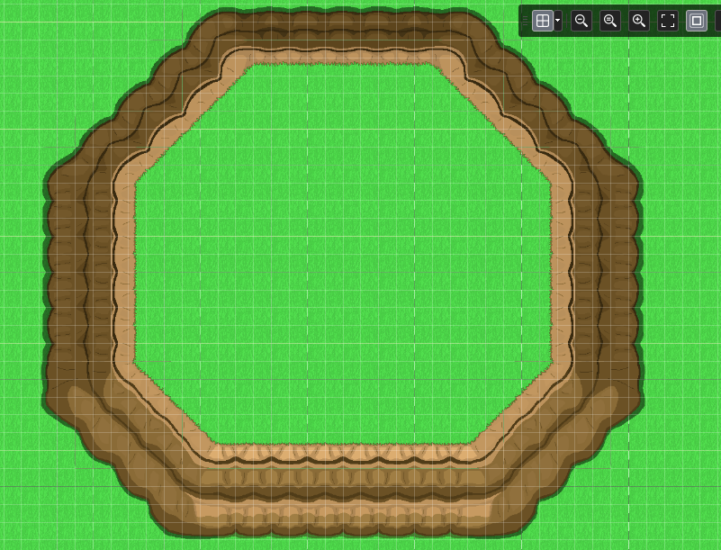
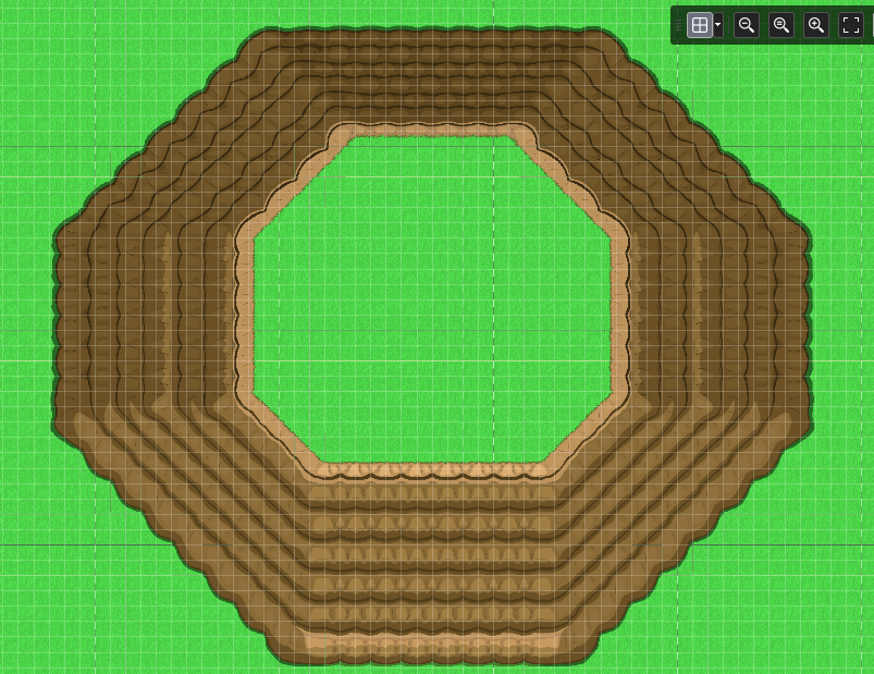
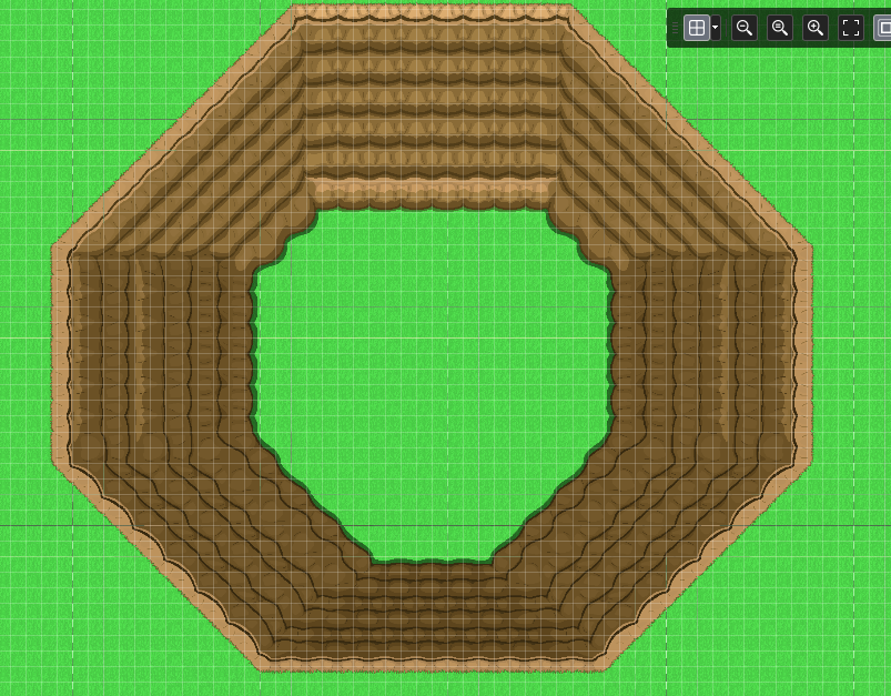
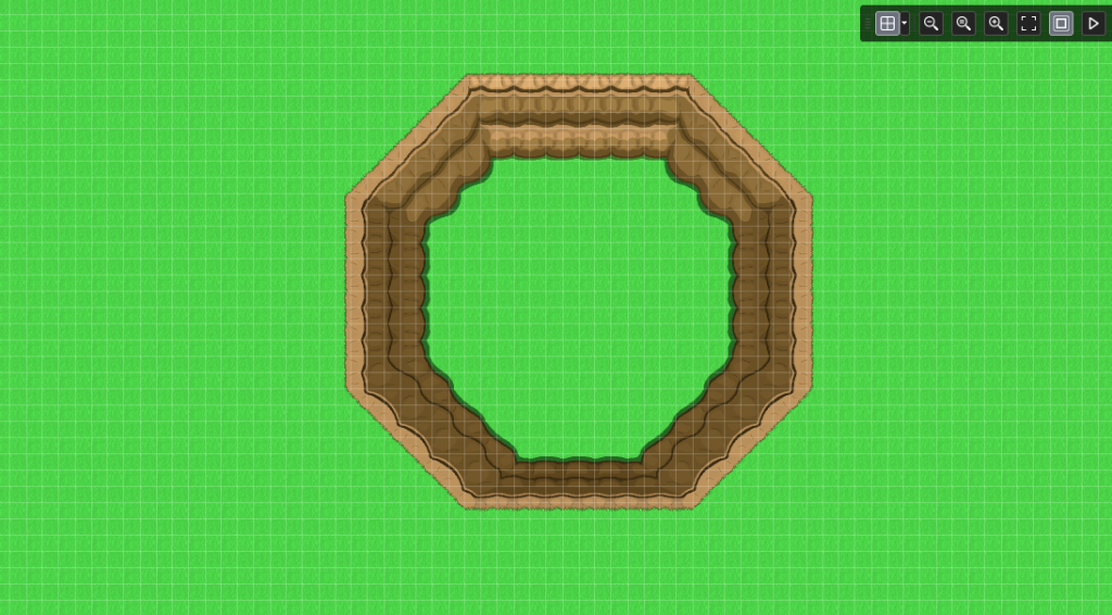
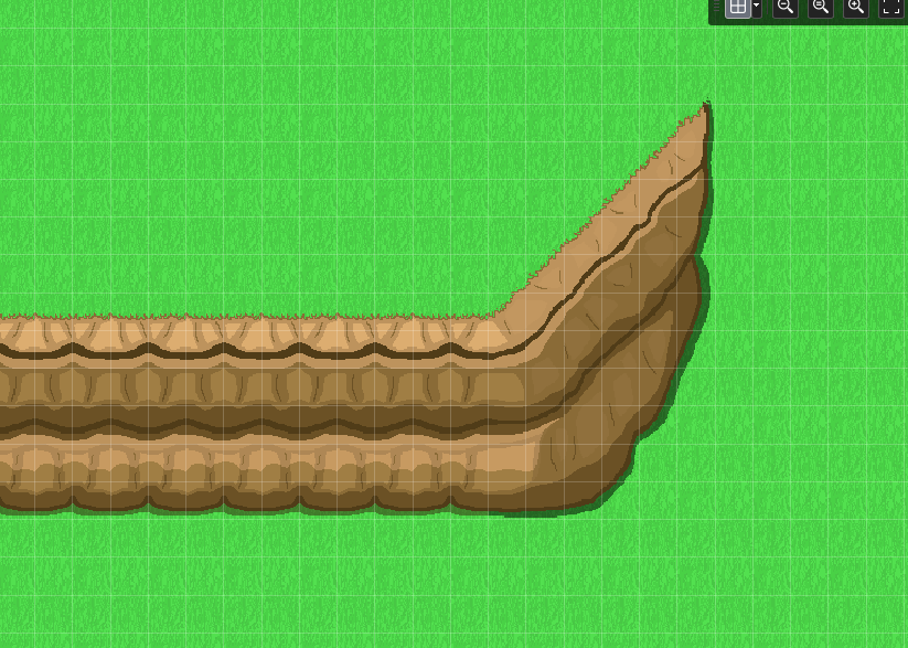
Infinite Tileable Cliffs
Hannah’s has been a beast with these cliffs! We added cliffs originally for concept, but we really needed a way for them to be able to stack as tall as we wanted to them to be — so we could not only build hills, but mountainscapes. These almost finished, but we wanted to share the progress of what we had so far:
Conclusion
With most of the basic landscape assets in place, we are beginning to create a more realistic game world. It’s really awesome to see all of this art starting to come together! Stay tuned!
