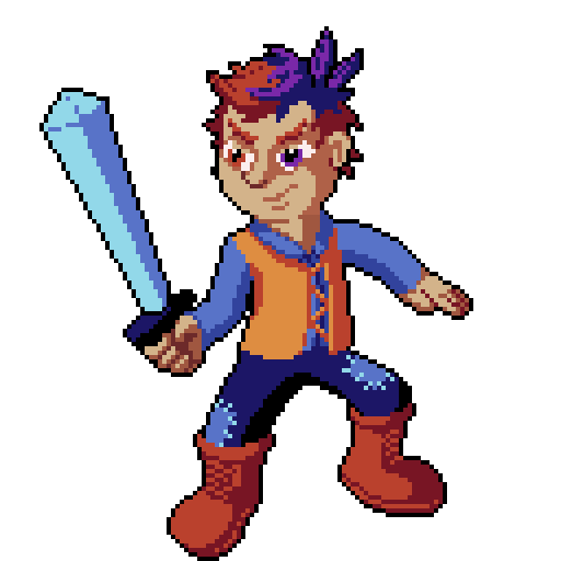
Tony has been creating some amazing art and animations and we can’t wait to share some with you. When we began our work in January, we decided to update the previous mockup of the hero to be more cohesive with some of the design and game elements that have been created since the original concept. Without spoiling too much about the hero’s attributes (such as name and personality), we had a few concepts that didn’t make the cut:

Originally we were trying to come up with “a Violet scar” on the hero. We liked the idea, but wanted to try a few other concepts.

Playing off the scar idea, this concept showed a much older looking hero. However, our hero is in his older teen years, and I don’t know too many teenagers who can grow a goatee that well. 😉

Though this hero looks like a beastly warrior, our hero begins his journey as an underdog. We originally landed on this concept for our hero:

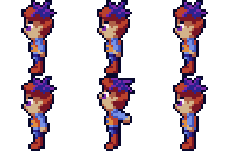
We decided to use the “scar” idea and have violet leaves growing out of our hero’s head. However, when translating to 32×32 pixel art, we found out that the leaves made our hero looking like he was wearing a bow, giving him a more feminine look.

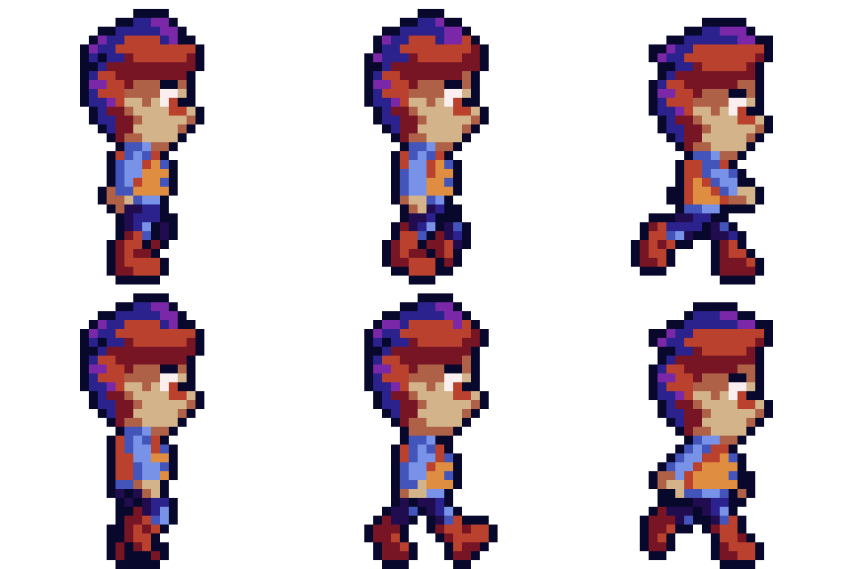
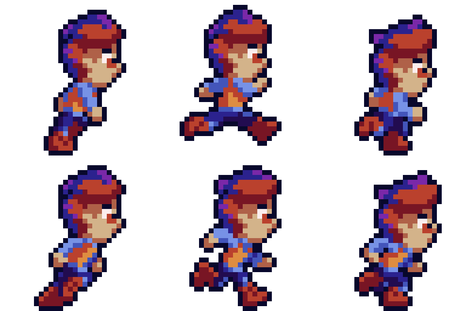
We didn’t recognize this until showing a few people the walk, idle and run animations. So, we went back to the drawing board and landed on this concept below:

It actually worked out in our favor to update the scar from leaves to, well, a different leaf design. We ended up going with an idea similar to Celeste where each time the player uses the special dash, dodge or spin powers, the violet in the hair would fade to brown. It’s a cool subtle detail that helps give the hero his trademark design. To do this, we take the below artwork and transform the odd colored pixels in the hair into violet colors, depending on how many petals in the UI are remaining:

Finally, we have an awesome walking animation and running animation. Before, we simply just had a walking animation that cycled the frames faster the faster the hero moved:


Environment
Tony has also updated a lot of the grassland’s environment too — giving new color and animation to much of this biome. You’ll see we also updated a few UI components as well! Finally, we updated the graphics of the cliff tileset as well as made them more easy to implement in game:


Other Notable Updates
In the middle of January, we decided to update from Game Maker Studio 2.2 to 2.3. For the most part, the port was pretty simple. The biggest thing was that other became a struct, so we had to update all other to be other.id. After that main breaking change was fixed, we began overhauling how walls and tiles worked. Having proper tilesets for our new cliffs, we decided to start using tiles instead of objects. However, our wall objects are critical to the AI we’ve created for enemies. Therefore, we’ve been working on a way to have the best of both worlds. We are close to having this system complete, but it is still a work in progress. In fact, the main demo room doesn’t build right now because of the overhaul. It will be nice to get back to “playing the game” again. 🙂
