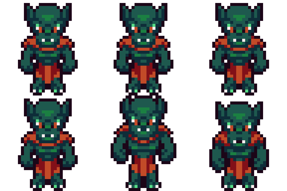
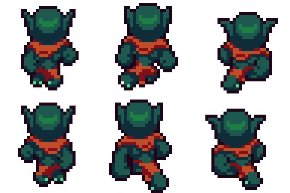
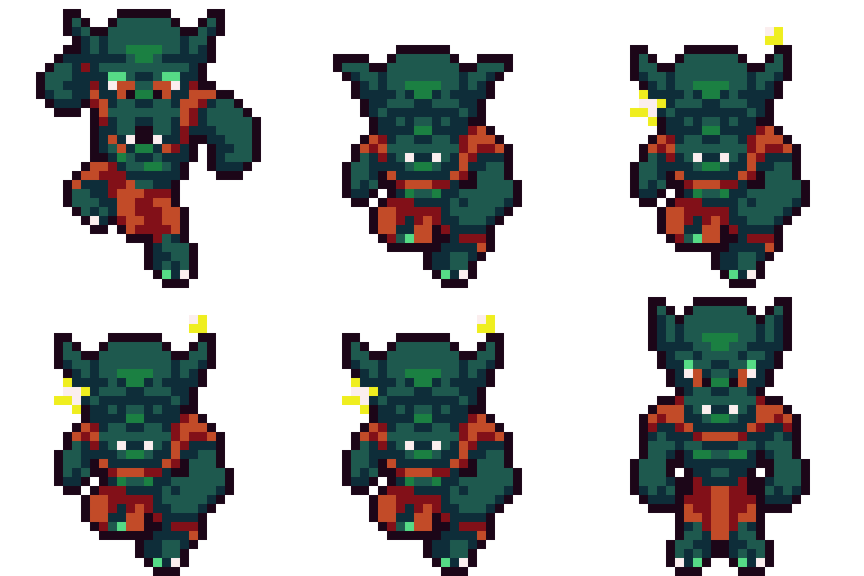
These past couple months we’ve been focusing on updating one of our soldier enemies, the Orc. The Orc is one of the more simpler soldier enemies in that it’s weaker, generally slower and its reaction time lacks. It’s been fun seeing this guy come to life and we can’t wait to share some of the animations here:


Other Notable Updates
Renderable
In our previous post, we did not have a notable updates section, mainly because we were still in the middle of updating two major systems. Both of these systems have to do with depth, or, where the object is drawn on the screen. The default depth system in Game Maker Studio has served us well, but with the ever increasing complexity of the layer depth system, draw order gets blurry when dealing with transitions between on layer depth and another. This link explains some of the same issues we’ve been running into.
We started down the road of implementing a z-tilt shader, similar to how this blog implements it. However, we found a bug with rendering tiles. As we continue to wait for the resolution, we simply decided to update the default depth system, as well as update different places where layer depth was being triggered. For example, previously we were triggering the layer depth at the two openings of a bridge over water. We decided to make all land and bridges over water layerDepth1 and all water and inside caves layerDepth0.
When we jump off a cliff and into water, we trigger layerDepth1 to layerDepth0 and simply multiply the depth by a negative room_height. When entering a cave, there is a fade transition that sort of masks (or hides) the fact that there is a draw depth problem. This solved most of the draw depth problems for now — though it won’t solve issues like stair transitions from a lower area to an upper area. We still plan on using z-tilt in some way as that is really the only to solve for properly drawing objects with this complexity properly.
In the same vein, we’ve also been updating our drawing system (the pipeline to be more consistent) and shadow system, as well as adding a z axis. z gets complicated when we’re in a 2D space. What is z? Where should it be drawn? Where is the collision with respect to the visuals? All of these things are very hard to get right, so most of the time, we don’t use z, but something we made up called zPseudo.
zPseudo keeps the current visuals and the collision at its normal y position. Therefore, the purpose of zPseudo is to render the shadow zPseudo units down from the y position. z on the other hand renders the shadow at the current y position and renders the image of the object z units up. In 95% of our use cases, we found that using zPseudo was a better system for visuals and collisions. For example, a bat that is flying uses zPseudo casting a shadow 32 pixels from y. If the bat collides with a sword, it made more sense for the sword’s visual to overlap the bat’s visual, so that the bat would get hit. The 2.5D perspective is very odd, but our brains believe it to be true!
This system was complicated to come up with, but it’s proven to be very useful in making all of the game use shadows, heights, z positioning consistently across the board. For example, each projectile (arrow, fireball, ice particle, etc.) all implemented their own way of shadows. Now they all inherited from the parent object, Renderable! We were also able to therefore implement a consistent gravity function, giving objects a sense of falling or being dropped. The possibilities are now endless of what we can do with this system!
Ranking System
That last section was complicated, so thanks for sticking through our ramblings! The rest is straight forward and more fun “game” things!
Our weapon ranking system has been revamped! We used to use letters E – A, S, where E was low quality and A, S was best quality. We now added the letter F as worst quality, and added +/- rankings for each letter grade as well (except for F and S)! The reason for this was we found that merging weapons that were not the same letter grade was cumbersome. Therefore, we added the ability to merge any letter grade. We still have to merge the same weapon type though.
We also added the ability to merge anywhere instead of going back to the town to merge weapons. We found merging anywhere to be more rewarding help the player continue to adventure. With that said, we’ve had to update our merge system quite a bit. Even though we’ve made some updates to our merge system, we still find it tedious after a while to merge many weapons and will probably implement some sort of “auto merge” system.
Finally, we didn’t want to leave our town’s blacksmith without a job, so we added the ability for our blacksmith to take weapon shards and expand inventory! Weapon shards can be found when a weapon deranks. This helps the player to not feel like using a good weapon is a bad thing because they’ll be able to use those shards to make further progress within the game! Plus the higher the ranked weapon is, the more shards that will drop from a degraded weapon. Plus, we can easily remerge our lower-ranked weapon back up!
Everything Else
- In adding our Orc, we’ve updated our
soldierenemy a bit to be smarter! One thing we added was for the enemy to move out of the way of moving projectiles. Smarter enemies are better at doing this than others. We still have a lot of rework to do with the new animation updates to make thesoldierenemy a bit more seamless. - We’ve merged the way our
tile layersystem handles the tiles so that each layer has three sub layers: the base, overlay and animated overlay. For example, what we were once callingdecor tilesis now in the animated overlay. Paths on the grass tile would be in the overlay sub layer. And of course, the grass tile would be in the base sub layer. - We noticed an issue when swinging our balanced weapons up that sometimes smaller enemies would not get hit if they were between the balanced weapon’s visual and the hero. We fixed this so that the balanced weapon has a bit more collision below its normal visual.
- We updated the targeting system to be a bit more accurate. Plus, using the
R-Stickto move between enemies should be a bit more intuitive and better to use. Also, instead of using the “Ocarina of Time” triangles, we’ve resorted to a more simpler “triangle over the targets’ head”. - Finally, we added a system called “animation position” that let’s us move an object to a position based on the animation frame an instance is on. For example, our Ambush’s protection can now more accurately be position on the Ambush’s head for each frame of the animation.
