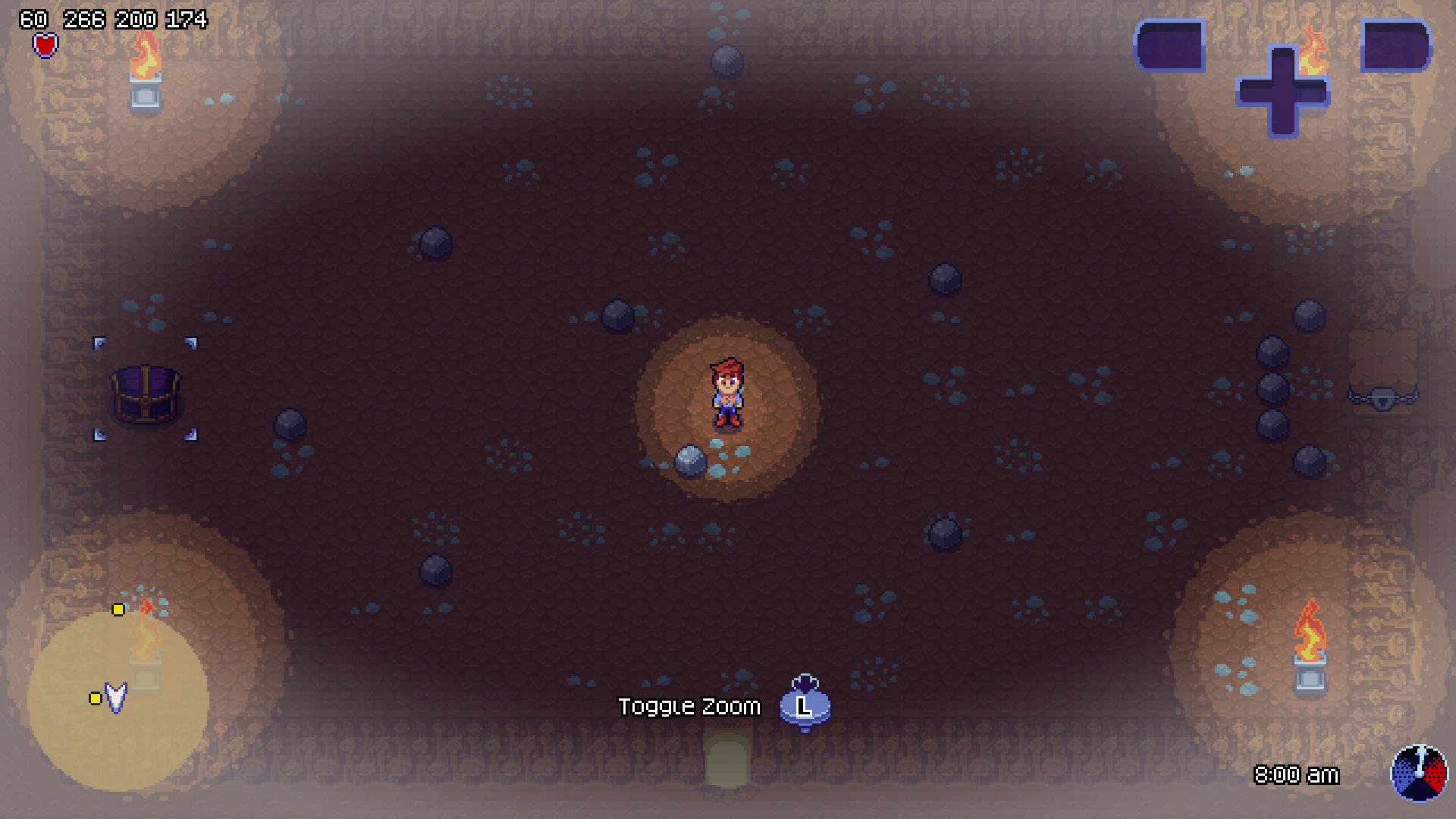
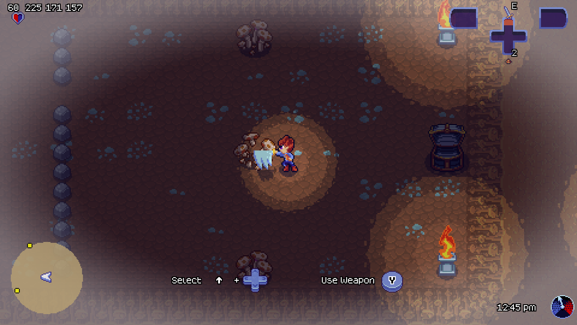
This is another one of those hodgepodge of updates posts. However, we already named a post “A Hodgepodge of Updates”. Therefore, we decided to name the post with one of the main new features we added in the last couple of months — the beginning of the game (i.e. the tutorial)!
I (Dan) hate tutorials in games. I’m the type of gamer who just wants to play the game and figure things out on my own. Therefore, we made the tutorial succinct and to the point (and there’s even a way to quit early if an experienced player knows how!). We believe the tutorial shows the game loop well, while explaining the basics of the game. The best thing to do is experience it for yourself! Until then, a few screenshots will have to do:


A couple of other updates you may have noticed in the most recent build of the game:
- The minimap icons have been updated.
- We have a cave tileset, with a looping cave texture that repeats for those “out of bounds” areas (i.e. the void).
- We added a concept of gates and locks, which require unlocking by clearing out enemies, a key, or by some other means.
- We added hit effects (slashes) as well as changed the damage color an enemy takes. This in turn means we removed the blood particle effect.
- We made the rounded corners in the UI for drawn shapes (i.e. programmatic art, like circles) more pixelated. Game Maker apparently draws its shapes at screen resolution and not the surface resolution, which ended up taking a week of reworking fonts / code / etc.
We also added many UI sound effects to help the player know which buttons / inputs are being pressed / used! Unfortunately, those are not observable with these screenshots.
Minotaur Updates
We made quite a bit of progress on the Minotaur these past couple of months. Firstly, the Minotaur dying:


Next, we’ll showcase the Minotaur’s dash attack:


As usual, progress can create setbacks. After we created our stun animations and tested with a few players, we realized the startup of both the dash attack (as seen above) and the stun animation were very similar, causing players to be confused whether the Minotaur was going to attack or be vulnerable. I (Dan) personally don’t like in games when an enemies telegraphed animation is similar — especially in making split second decisions. So, sympathetically, we decided to change all of our stun animations to correct this problem. Below is an old version (which we’ll see how similar it is to the left dash attacks above):

And below is the current, updated Minotaur stunned animation:


Other Art Updates
While taking a break from the Minotaur, we also did a lot of color and effect updates. We’ve mentioned some of these updates already (the slash effects). Therefore, the rest of this section will show off the remaining updates:
Clouds and cloud colors
We removed the cloud effect particle and replaced it with our own “cloud particle”. We won’t go into all the details of how the clouds work, but we will show off a few updated screenshots:


When it is sunny, clouds will cast a nice, dark blue shadow. When it is cloudy, these colors become a mix between a nice dark blue and a cloudy gray. Inside, we change the void color to be a mix between dark brown and cloudy gray. That is a great segue into:
The Void Color
When we are inside a building, and we don’t have a texture, we will use a void color. This color used to be black, but we decided to give it a little flavor, depending on the building. For example, when we are inside a house, we get this nice dark brown:

As we saw above, when it is cloudy, we mix the two colors. When it is night, we replace the void color with our night time dark blue:

This is a good segue into:
The Nighttime Color
Much like the void color, we were using black to represent night time. However, we changed this color to be a dark blue as shown below:

The difference is night and day… or, comparatively between some of our other nighttime screenshots, more pleasant looking.
Removed the Fort Fog
Fort fog was one of those things we added very early in development with Violet to test being “inside a building”, before we actually had artwork for buildings. Now that we have buildings and concepts of being inside / outside, we decided to remove the fort fog. The difference is night and day:


Cliff Decor
Finally, we added some random decor to the cliffs to give it a little less of a pattern look:

Other Notable Updates
Unlike our two recent posts, there isn’t as much to share in detail within this section. Below is our bulleted list:
- Performance Increases. These past few months have increased performance in our game dramatically. We added a couple of optimizations as well as a few fixes. For the first time in a while, I (Dan) feel proud to show off the game.
- Slow Motion Debugging. We came across a function
game_set_speedthat let’s us toggle the framerate at which the game is running. Before, we’d change this value in the game settings if we needed to see if animations we’re running correctly / at the correct speeds / etc. However, running at 2 frames per second made this very cumbersome to test. With this find, we can toggle the framerate at the moment we need to! - Fix Playback Input. With the updates to our path finding, we broke quite a bit with the input recorder / playback. We finally got around to fixing this (again). It was really cool to “watch” someone play through the tutorial without having to sit next to them!
- Made Picking Up “A Too Heavy Object” Not as Punishable. One thing that was frustrating me and other players was that if
Awere pressed to try to pick up a dropped item, and instead we were close enough to an enemy, we’d try to pick them up instead! The game would not let the player move until the “too heavy” animation was done. For really heavy enemies, this could last a couple of seconds, where the player would then get punished. We made this so the player could “interrupt early” by simply moving during any “too heavy” animations. That way if an accidentalApress occurs, they won’t be punished by it.
