After the disappointing month of March, we took some time to recalibrate once again. After a long couple months of silence on our end, we are pleased to announce some long overdue updates. On the name front, we can’t quite reveal this yet (per our lawyer), but we can at least share the good news that we’re still able to use Violets in some capacity!
Even though we had some time of recalibrating, we also can’t deny that the months of May and June have been busy for us outside of this project. As you may know, a little game called The Legend of Zelda: Tears of the Kingdom came out. Being that Tears of the Kingdom (TotK) is a direct sequel to The Legend of Zelda: Breath of the Wild, a game we took a lot of our original inspiration from, it was critical that we took the time necessary to play through and understand what the game was about. Many choices, ideas, and game design moving forward (some which will be covered in this post) was definitely impacted by playing through Nintendo’s latest Zelda game.
Part of the recalibration effort these past couple of months was actually game planning / coming up with the tasks needed to be completed to make our game. All of this planning, especially after TotK coming out was no accident. We are certainly glad that it came out when it did. Giving a review / our opinions of TotK is beyond the scope of this blog. However, our biggest learning as it relates to this project is that there is a sense of traditional Zelda that is no longer present in Breath of the Wild (BotW) / TotK. Perhaps we’ll touch on that topic at a later date. For now though, let’s move on from high level talk and get into the updates!
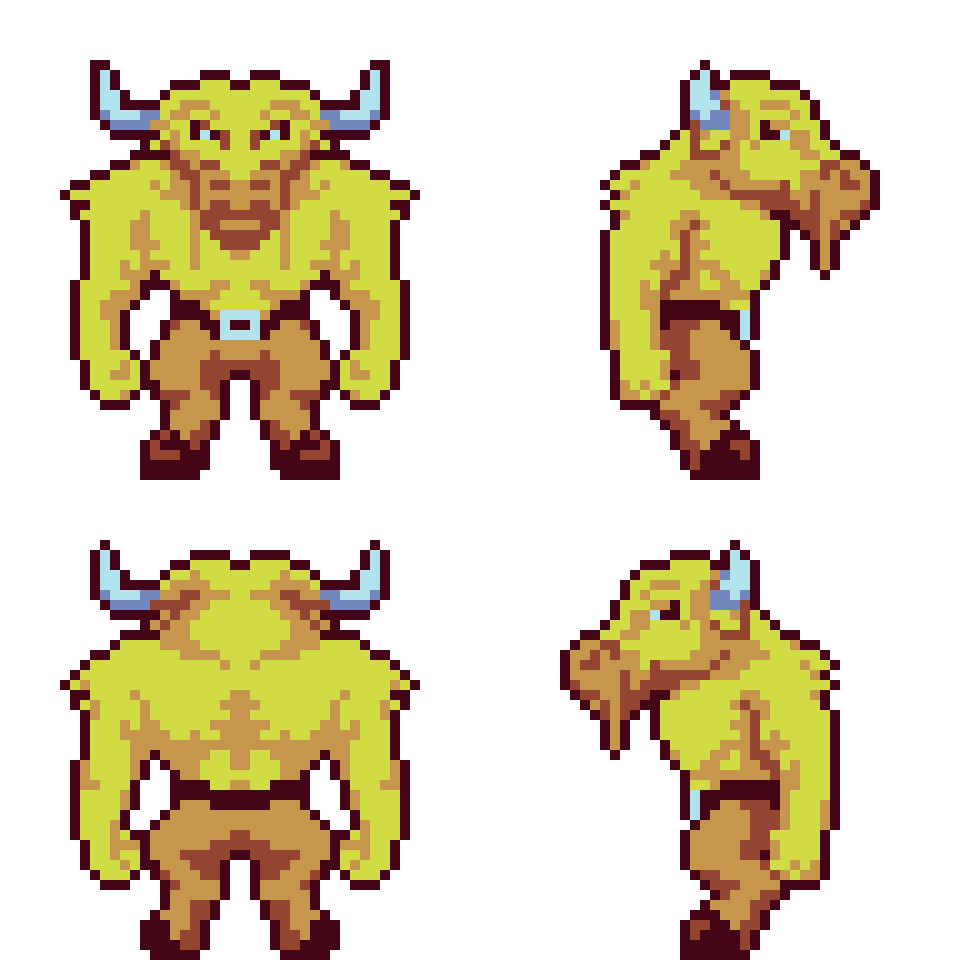
Minotaur Updates
Since we last posted, we shared some Minotaur updates, and we have even more to share below:


The minotaur has extreme strength, and Tony did a great job capturing this with these swings!
Soldier
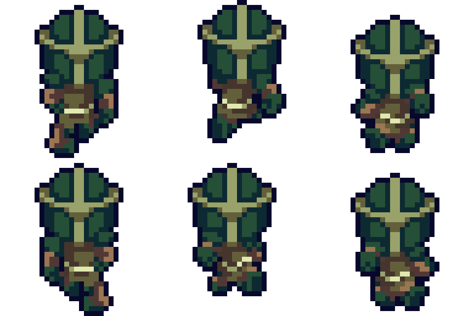
(Not to be confused with the enemy type Soldier). Castle town contains soldiers that protect the royal family and the population from danger. There’s also a special type of soldier that exists in the game to protect a special place (this is a bit vague, but this is the most we can explain for now without spoiling anything)! We wanted to save time and not design two different types of soldiers. Therefore, we made use of the palette swapper and made one version of the solider and swapped different colors to make two different types of soldiers out of one design.
Like anything new, we came up with a couple designs (in pairs) shown below:


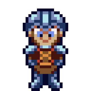


We ultimately went with the last design and came up with this final version:
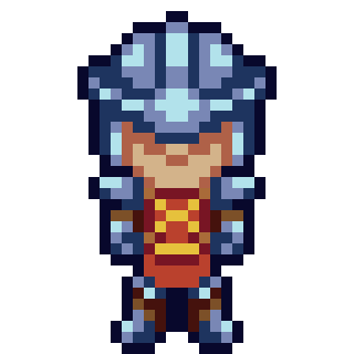

And we even have some walk and run cycles completed:


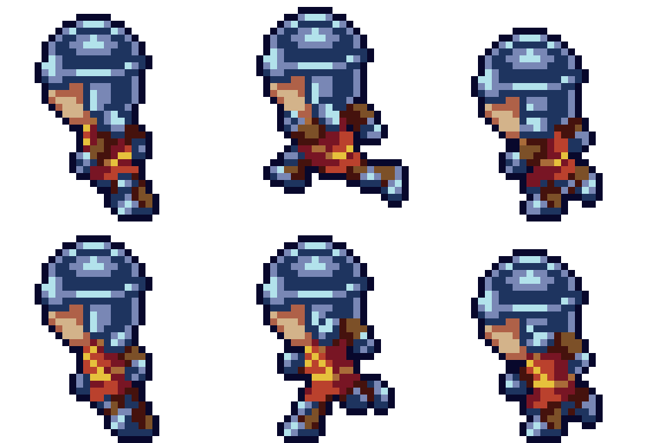

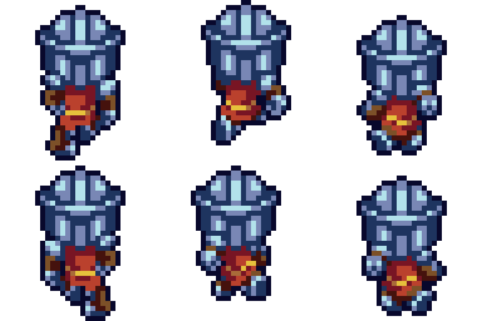
Yellow Enemy Variants
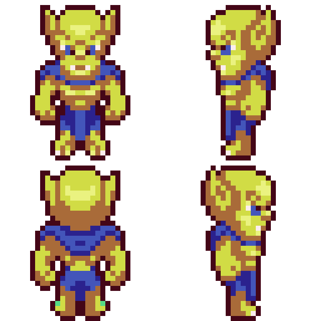
We decided that we needed another variation type that was on the medium difficulty side to help the pace / difficulty curve of the game. Therefore, we added yellow enemy variants, shown below:



Other Art Updates
Below are a few screenshots of a few other new art assets, including updated glows, signs and icons, boulders, pots and moveable blocks!


Game Design
One of major items we have been working on the past month is nailing down the answer to the question “What is Violet”? As mentioned in the introduction of this post, one of our learnings of playing the latest two Zelda entries was that the traditional Zelda experience is no longer present. Therefore, we believe in order for this project to standout amongst the vast crowd of games is to separate ourselves as much as possible from the “modern” Zelda formula and really deliver on “the traditional Zelda experience”. To us, this means many things. But to summarize it succinctly, it would be a “simple, progression based, laser-focused scope”.
Over the past month, we’ve began thinking about the design of the game. We’ve been brainstorming different collectibles, where they exist, why they are collected, etc. We’ve been deciding what areas we want to build in the game, why they exist, what purpose they serve in the game, etc. We’ve been thinking through what additional mechanics should be in the game, how they are obtained, for what reason do they serve, etc. Basically, we’ve been determining the purpose of the game. Originally the plan was to make this game a huge, 2D, open-world adventure. After playing TotK, I (Dan) don’t think bigger is always better. Therefore, we decided to get “laser-focused” on the areas we want to create and make sure these areas are full with fun, unique, and engaging content.
As discussed in our previous post, we pushed back the Kickstarter date. Part of these past couple months was actually beginning to build out the actual world. Before the events of the previous post, we were planning on making a Kickstarter demo that would throw away the world we’ve created. In order to deliver the project in a timely manner, we decided it would be better to create part of the world for the demo, that would be refined as development continues.
Before our previous post, we were experimenting with the actual world and how big it was going to be. The original world was going to be 18×18 sections (a section originally contained 6×6 zones and a zone was 480x480px). We even started building castle town, which was going to be 2×2 sections large! After realizing we needed to make this game smaller in scope, we ironically, we went back to the room size of the original Kickstarter demo, which was 9×9 sections. However, we found that to be a bit small (mainly with the fact that houses / dungeons / caves / etc. are as big on the inside as they are on the outside (breaking a convention here)). With the math involved, there wasn’t a divisible way to have an in-between size that encompassed 3×3 provinces (a province would contain n number of sections) with 81 sections that we were wanting. However, a thought eventually popped into our heads of “what if we made the sections contain 8×8 zones”? This made the original Kickstarter grid of 9×9 sections not feel as small anymore, while the world also didn’t feel too large either. Essentially, making the sections contain 8×8 zones made our 9×9 section grid feel like an original 12×12 section grid (6×6 zones), but utilizing the 3×3 provinces that we wanted from a world building standpoint.
Concurrently with building out new sections, we’ve also been coming up with the scope for the game. This has been a long and hard process. Much of the reason why this has been hard is that determining what should be cut, and what should be kept is painful. Up until now in my career, I (Dan) have always been on the other side of the conversation when it comes to cutting things. It’s much easier to say “no” when it isn’t ultimately your product. However, now being in the role of “the client”, it’s really hard to remove good ideas, for the sake of time and budget. With that said, getting “laser-focused” on what we are building will ultimately be for the best of the game. We’ve had a vision for the game (and honestly, we really haven’t strayed too far from this vision), but haven’t had any need for boundaries or rails up until this point. But with time and money entering the picture, it’s very important to put into words what this definition of the game will be, and of course, sticking to it!
Coming up with the scope of the game has also been tedious. We currently have notes and ideas in many different places. We’ve had to do a lot of consolidating on our part!
One of the more tedious parts was determining what resources (items) we wanted. We originally were planning on having many droppable resources with a few different inventories to organize them. However, a common shared complaint in TotK, was the cluttered, and annoying to sort through inventory system. Part of the problem in our opinion is that there is just too much stuff in that game. Therefore, we decided to scale back what was collected and why. For example, we were going to have resources in the game that served multiple purposes. Instead, we decided to give a resource one purpose, which makes the game “simple” and “laser-focused”. A good example of this is we decided to combine the Fire, Ice and Water Cores into one Element Ore that can be used as ammunition for the elemental rods. We originally wanted the ability to have the Fire Core be used for Fire Rods, as well as other purposes. But, cutting this idea in favor of removing extra clutter will help streamline the game.
Other Notable Updates
It’s been satisfying to start designing the game now that we have many of the game’s systems developed. We still have a lot more design / work to do, but we’re getting closer each step of the way! Below are a list of other updates we’ve worked on:
- Since we have another year of development, we finished worked on the horse from a functionality standpoint, and it works great! Now we hope we’ll have enough time to implement the art for the Kickstarter demo for the player to be able to ride horses!
- We mentioned yellow enemy variants above. With that addition came increasing the highest ranking from
StoSS. Now the ranking is as follows:F,E,D,C,B,A,S,SS. - As we were building new Castle Town, one thing we thought was “wouldn’t be cool if we could get on the roofs, jump off of them, etc.?” So, we decided to implement that feature. It required some updates to our
tileLayersystem, but it ended up being for the better. For example, one thing we realized was house walls were acting much like cliffs! Therefore, we refactored house tile layer into the cliffs, and cleaned up a bunch of unnecessary systems around that.
Jumping Off Roof - Along with our
tileLayersystem updates, we also added two other types of tiles: holes and shallow water. - We added a
No ControllerDialog (to help the player know if their controller is connected):
No Controller Dialog - We added a position editor to help us position weapons / items on the
Livingobjects. Before we were doing this manually by going into the art canvas, positioning the sprite there, and manually calculating the offset, and typing it into the code. Now we have a debug in-game editor that does all of this and outputs ajsonfile with this data:
Debug Position Editor - You may have noticed that the HUD contains icons for the L / R Shoulder buttons now. We decided to combine rods as a group of weapons (much like balanced or agile is its own group). We also found that it was easier to not swapped the “Dpad pages” with the shoulder buttons. Therefore, we assigned the rod / special weapon selection to the shoulder buttons.
- We overhauled our buildings system (inside a house, cave, etc.). In this post, we mentioned that buildings being as big on the outside as they are on the inside. To make this work, the “inside” of a building exists in the same game room as the outside. Therefore, we need a way to determine when a Interactable object is inside or outside. The old way of making this work was to draw primitives that created tris (triangles), and these tris would create rectangles, or tiles that we could use to determine if something was inside. Here’s a simple example:

Primitive If you look closely at the red line, it makes two triangles, which form a rectangle. Pretty neat. But, what if we have a complicated building, or a cave system like below:

Primitive This creates all the rectangles we need, but is an utter mess to maintain. For example, as we were designing this cave system, we changed the layout multiple times, which required us to update this primitive. We decided that this needed to be simplified. Now, if we want to create a building, we basically lay down a tile overlay of what the boundaries should be:

Building It’s quick to update and easy to maintain. We had to write some code around how to actually interpret these tiles to create actual “insides”. But now that this work is done, creating additional buildings, cave systems, etc. will be a breeze.
Conclusion
We recognize it’s been a while since our last post and we appreciate the patience! We’re hoping we can share some bigger news in our next few posts. You know… things like what the story is, the name of the game, what our characters name is, who the villain is, and some art of different things that we haven’t been able to share yet. Stay tuned!
